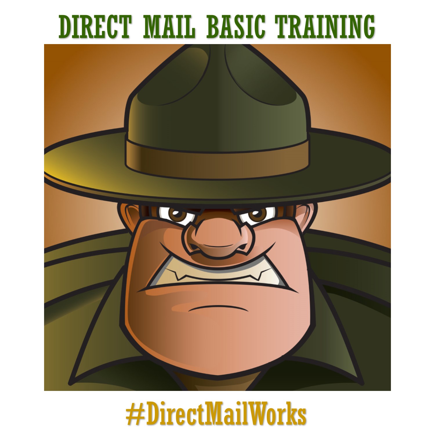
With Easter just around the corner, many of you are putting your direct mail campaigns together now. We’re sharing some basic tips to ensure your campaign is a smashing success!
KEEP THE DESIGN SIMPLE
The digital world is filled with constant change, complexity and instability. Many audiences want a return to simplicity. In 2019, minimalism is the way to attract attention. An image with a clear purpose will prevail every time. Keep your text short and on point. Maximize white space and find a layout that’s simple, clean and authentic.
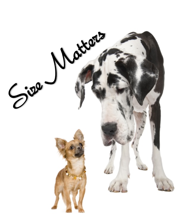 SIZE MATTERS
When picking up mail from the cluster box, don’t forget that large pieces command attention. It doesn’t cost any more postage to mail a 6X11 postcard than it does a 6X9 and the difference in paper cost is nominal. The only real differences are that you get more real estate to promote your message and your piece will stand out in the mailbox.
INCORPORATE INTERESTING FOLDS
Create a fun mail piece by adding folds. These go beyond touch by requiring people to manipulate the piece. It creates an urge to see more by building up people’s curiosity. BE CAREFUL THOUGH! Make sure you don’t lose your automation rates by placing a fold or an open part of your mail piece in the wrong spot. Have your creative team contact us for guidance.
TELL THE STORY THRU CONTENT & PICTURES
Storytelling is a crucial aspect of direct marketing. Think about using strong and compelling visual images to convey your narrative. Combine your images with precise and well written copy.
BE COLORFUL
Color is key. Your choice of color can make or break a good print design. Colors have the power to change moods.
Red – This color typically used to create a sense of urgency, which may be why you often see this color used during clearance sales. Red is also associated with movement, excitement, and passion.
Blue – This color is often used by brands to promote trust in their products and services because this color is associated with security, peace, and reliability. Blue is also the preferred color of male consumers.
Green – Brands sometimes use green within their stores to relax customers because this color creates harmony within the brain and encourages balance. This color is also often associated with power, nature, and tranquility.
Orange and Yellow – These colors are more cheerful colors that promote a more optimistic attitude while also creating a sense of urgency that can cause more impulsive buyers to act.
Purple – This color has been known to stimulate problem solving and creativity within the mind.
Purple is also associated with respect, intelligence, and royalty, which may explain why it’s often used to promote beauty and anti-aging products.