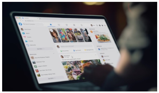
In early May, Facebook introduced the new Facebook.com. Announced last year during F8,
Facebook’s annual conference about the future of Technology, it is now the global web
experience for Facebook users.
For some time now, Facebook focused on the mobile experience, but found that the desktop site had fallen behind. Users need the desktop version to be kept up as well.
The new Facebook is meant to help you find what you’re looking for faster with new
streamlined navigation. It’s easier to find videos, games and Groups, and the home page and page transitions load faster. It’s similar to the mobile experience.
Lower brightness, alongside contrast and vibrancy, are part of the new dark mode. It
minimizes screen glare for use in low light, wherever you are.
The new site makes creating Events, Pages, Groups and ads on Facebook easier too. You can preview a new Group in real time, and see what it looks like on mobile before you create it.
As with all upgrades, there are some glitches and it may take you a few minutes to find features that have been moved around. Overall though, the new Facebook.com is faster and streamlined, something that was needed for a long time!
